
Introduction
In a world where we are getting shorter attention spans and longer emails, have you ever thought about how to stand out and get your audience’s attention over email? Most of the people check their emails on mobile phones, tablets, and desktops. As a result, you as an organization must ensure that your emails look excellent and perform across all screen sizes. Here’s where responsible email templates come into the picture, a one-stop solution. This blog will take you on a journey of responsive emails.
What is responsive email?
Responsive design refers to the ability of a website or email to adapt to different screen sizes and resolutions. A responsive email template adjusts its layout and content to provide an optimal viewing experience on any device.
Increased screen time and devices mean more opportunities to capture your target audience’s attention.
Almost 79% of consumers admit that they have become accustomed to deleting emails because they cannot read them on their phones. With the growing popularity of smartphones and tablets since 2010, this figure is bound to increase.
To maximize engagement and effectiveness responsive mail templates are important.
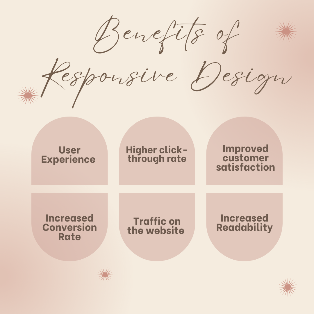
Benefits of Responsive Design

1. User Experience- Responsive design ensures that your emails look great on any device, whether it’s a smartphone, tablet, or desktop. This consistency in presentation enhances the user experience, making it easier for recipients to engage with your content.
2. Higher click-through rate- Emails optimized for different screen sizes lead to a higher click-through rate. When users can easily read and navigate your email, they’re more likely to click on links and take the desired action.
3. Improved customer satisfaction- A seamless experience across devices can significantly improve customer satisfaction. When customers can easily access and interact with your emails, it reflects positively on your brand, fostering trust and loyalty.
**4. Increased Conversion Rate-**By providing a better user experience and encouraging more clicks, responsive emails can lead to increased conversions. Whether your goal is to drive sales, sign-ups, or other actions, responsive design helps you achieve these objectives.
5. Traffic on the website – Engaging, responsive emails tend to drive more traffic on the website and landing pages. The increase in the traffic rate results in more opportunities for customer engagement and conversion.
6. Increased Readability- Conveying clear and legible content is very crucial, responsive design adapts to the user’s device and makes it easier to read and a well-designed email ensures that the content is accessible to all.
Tips and tricks for optimal display across display devices
Design and Layout
1. Single-column layout: It helps to make the design simple and ensures that the content is easy to read on all devices.
2. Maximum: Maximizing the email template between 600-700 pixels for desktop help with the resizing for other screen types.
3. Content: Important content and objectives should be placed on the top so it’s visible as the mail is opened.
4. Mobile-first Approach: The email template should be designed for the mobile user and converted for any larger screen.
Text and fonts
1. Web-friendly fonts: To enhance readability and compatibility, one should use web-friendly fonts like Arial, Georgia, and Times Roman.
2. Spacing: Adequate line spacing will enhance the readability on smaller screens. Proper spacing between the paragraphs will make it easy to comprehend.
Future Trends in Responsive Email Design:
- Personalization- Personalization in e-mail marketing has moved beyond simply addressing recipients by their first names. This now entails creating highly customized experiences grounded on user data such as behavior, preferences, purchase history, and demographic information. The use of personalized emails can greatly increase engagement rates because they make the recipients feel recognized and valued.
- Integration and consistency- The rising complexity of digital ecosystems has necessitated the integration of email with other marketing channels. Today, customers interact with brands through various platforms such as websites, social media, mobile applications, and offline activities. Consistency in branding and messaging across these touchpoints is critical to building a strong brand identity and trust with your audience.
Responsive email design facilitates this merger by ensuring that email designs mimic the visual theme of the brand’s entire online presence. This not only supports user experience but also helps enhance brand recognition. The move ahead will see an ongoing shift towards a more consistent and united brand experience, where responsive design takes center stage.
- AI and email template- The transformation of digital marketing by artificial intelligence extends to email. Various parts of emails can be optimized using AI-driven tools, for example, the content and delivery.An example is how machine learning algorithms can use user data to determine the most suitable time to send an email, predict the effectiveness of a subject line, or even create personal content. The role that AI plays in responsive email design is highly fascinating. Al can recommend better layouts and designs for every segment of users by studying how different types of users relate to emails. This includes enhancing engagement and conversion rates by optimizing images, fonts as well as call-to-action buttons. Additionally, Al can support in automating A/B testing thereby helping marketers identify quickly the best-performing designs and strategies.
Conclusion:
Responsive email design plays a crucial role in seamless customer experience across all devices. With the digitalization of the world implementing best practices and following future trends can enhance the effectiveness of email marketing.